SATS
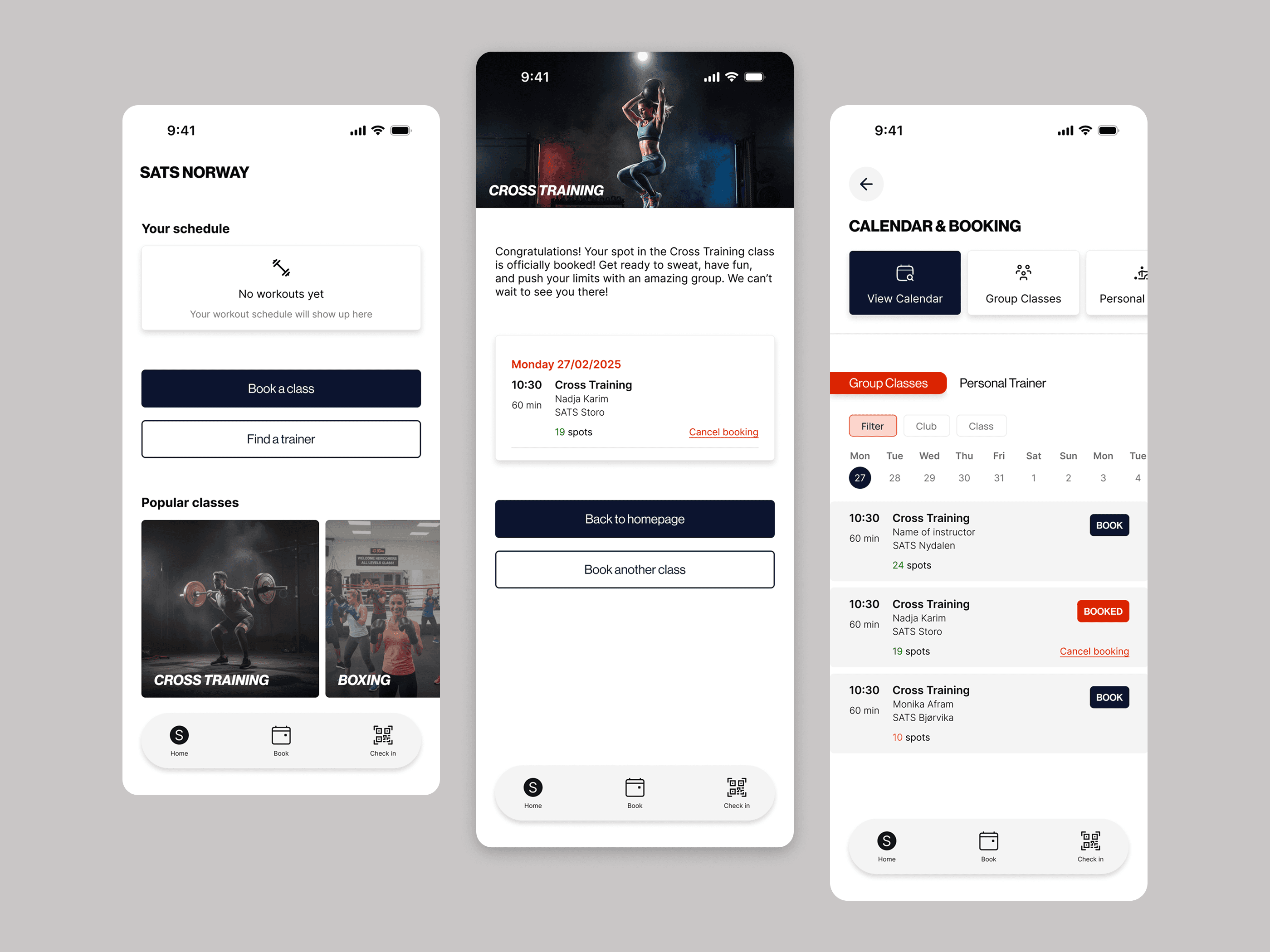
Redesigning SATS Booking experience through User Testing.
Tasks
UX Design
Research
User Testing

Findings & insights
Test goal:
The goal of the user testing was to evaluate how intuitive the booking flow was for new and existing users, and to identify friction points in navigation and booking confirmation.
Method:
Test type: Moderated usability testing
Format: In-person
Number of participants: 4
Duration per session: 10 minutes
Participants:
4 participants aged 30-35, All train regularly but at different gyms and some doesn’t use booking apps.
Test setup
Tasks participants completed:
Find a crosstraining class on a specific date and gym.
Book it.
Find the overview of that class.
Cancel the class.

Summary of findings
The test showed that the participants generally understood the main booking flow, but experienced uncertainty around navigation, especially in finding the overview of the class and cancelling the class.
Detailed findings
Finding 1: Navigation was unclear.
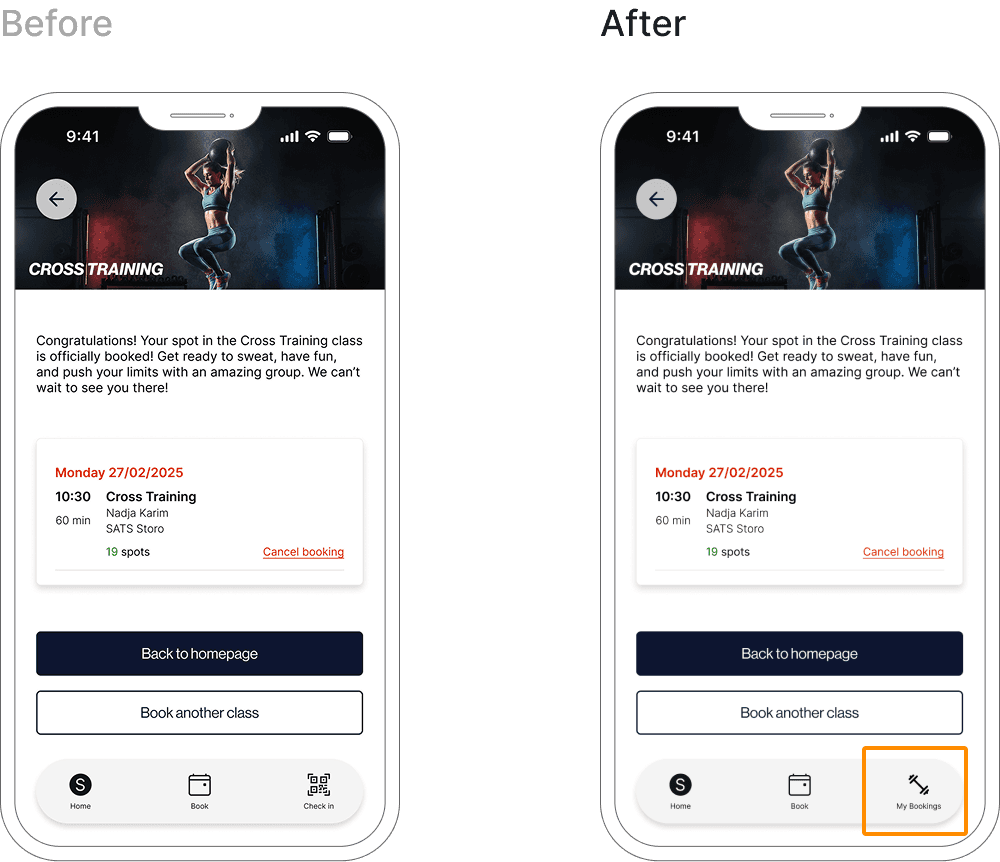
3 out of 4 participants hesitated where they could view their booked classes. The 3 participants overlooked the popup button showing “ View Class”.
“Where is My classes? I expected it to be easier to find.”
Insight
Users expect personal content to be more clearly visible and consistently placed in the main navigation.
Impact
This caused unnecessary time spent and uncertainty about wether the booking was successful or if they booked the right class.
Changes after testing:
Added a clearly labeled “My bookings” button to the main navigation to make booked classes immediately visible.

Finding 2: Lack of clear “Back” option caused confusion.
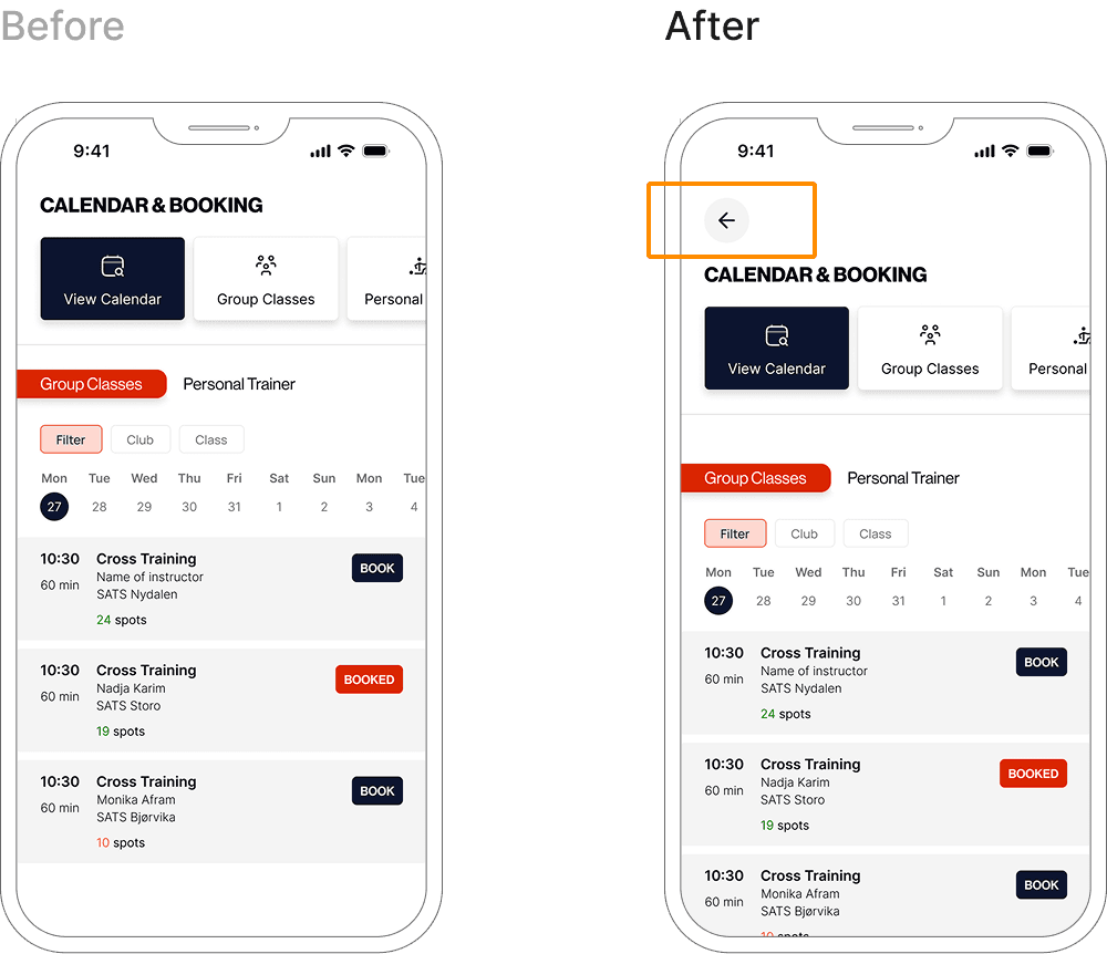
All participants experienced confusion when navigating backwards and were unable to easily return to the previous page.
“How do I go back? I went to the wrong page.”
Insight
Users expect clear and predictable way to move backwards in a flow, especially when exploring or correcting mistakes. The lack of a visible “back” button breaks users mental model of navigation.
Impact
This caused hesitation, disrupted task flow and increased the cognitive load making the experience feel less forgiving.
Changes after testing:
A clear back action was added to support error recovery and reduce user uncertainty.

Finding 3: Users expected an immediate “Cancel booking” action after booking.
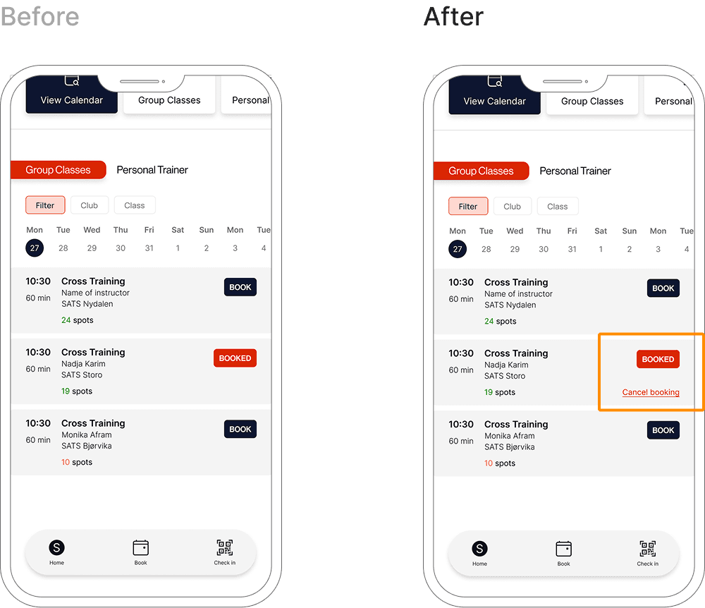
3 ouf of 4 participants looked for a way to cancel the booking immediately after completing the booking flow.
"I booked this by mistake, I’d want to cancel it right away.”
Insight
Users expect systems to be forgiving and support quick recovery from mistakes, especially directly after committing to an action. Adding an immediate cancel option aligns with users mental models and reduces anxiety around irreversible actions.
Impact
The absence of an instant cancel action increased uncertainty and reduced the users sense of control, particularly in scenarios where bookings were made by mistake.
Changes after testing:
Added a clearly visible “Cancel booking” action directly on the booking confirmation screen. I also positioned the cancel action close to the confirmation message to support immediate error recovery.
